Note
Go to the end to download the full example code
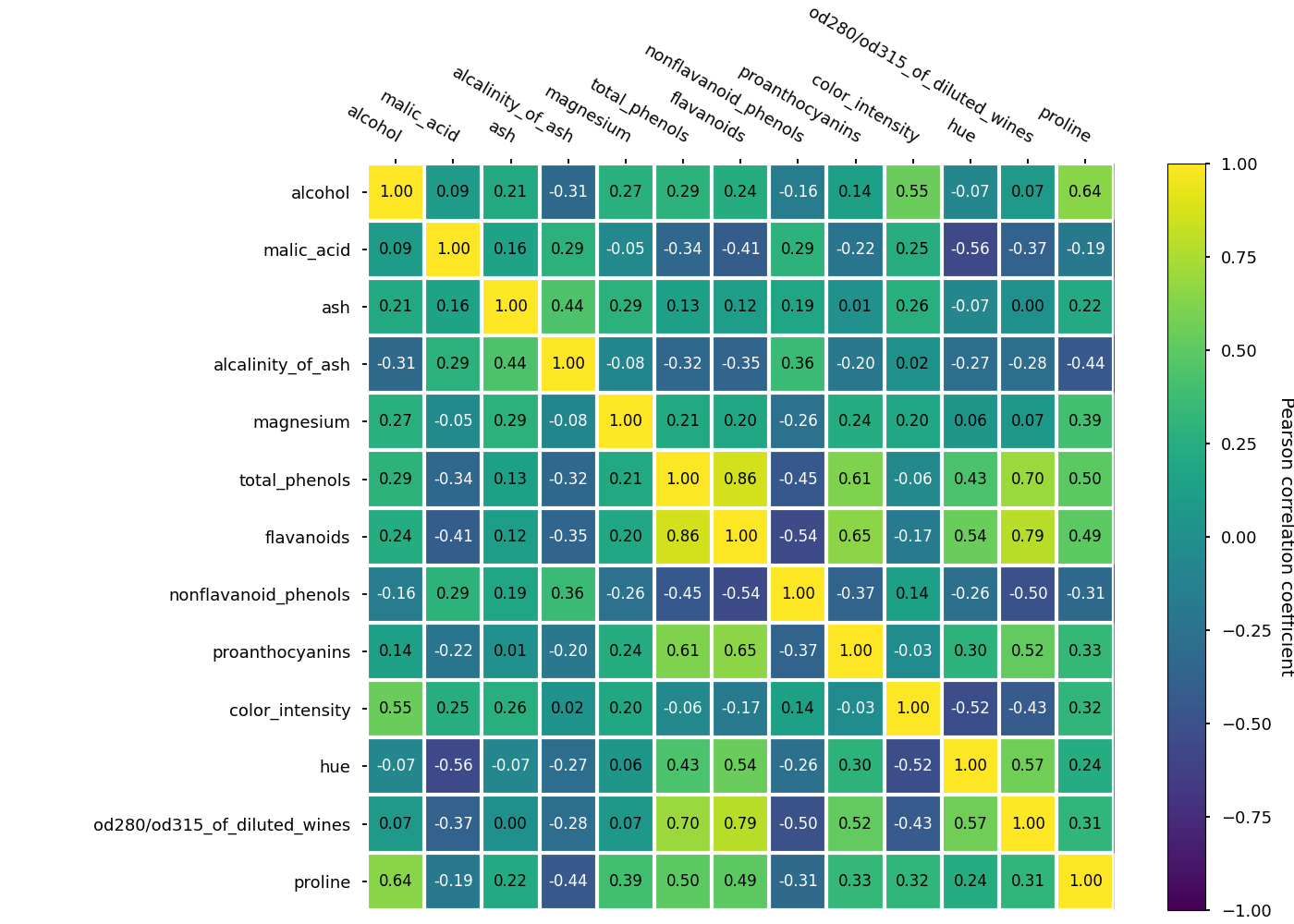
Generating a heat map of correlations
This is an example of generating a heat map for showing correlations between variables. The correlation between variables is obtained as the Pearson correlation coefficient.
The heat map is generated from a pandas.core.frame.DataFrame
and all pairs of variables (based on columns) are considered.
To better display the values of the correlation coefficient, the colors
used for the annotation of the values in the plot can be selected
with the parameter textcolors of the
psynlig.heatmap.plot_heatmap() method (please see the
documentation for more information).
from matplotlib import pyplot as plt
import pandas as pd
from sklearn.datasets import load_wine as load_data
from psynlig import plot_correlation_heatmap
plt.style.use('seaborn-talk')


data_set = load_data()
data = pd.DataFrame(data_set['data'], columns=data_set['feature_names'])

kwargs = {
    'text': {
        'fontsize': 'large',
    },
    'heatmap': {
        'vmin': -1,
        'vmax': 1,
        'cmap': 'viridis',
    },
    'figure': {
        'figsize': (14, 10)
    },
}

plot_correlation_heatmap(data, textcolors=['white', 'black'], **kwargs)
plt.show()
Total running time of the script: ( 0 minutes 1.576 seconds)