Note
Go to the end to download the full example code
Generating 1D scatter plots
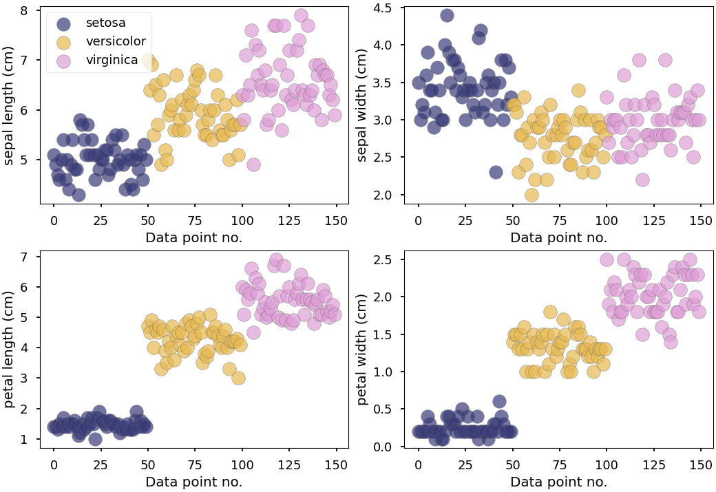
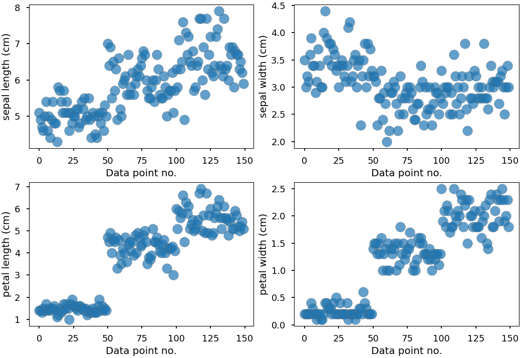
This examle will plot the raw data points in a 1D scatter plot.
The data points can be colored
according to class labels if this is available.
This is done by passing the labels for each data point (using
the parameter class_data) and a mapping from the labels
to something more human-readable (using the parameter class_names).
from matplotlib import pyplot as plt
import pandas as pd
from sklearn.datasets import load_iris
from psynlig import generate_1d_scatter
plt.style.use('seaborn-talk')


data_set = load_iris()
data = pd.DataFrame(data_set['data'], columns=data_set['feature_names'])
class_data = data_set['target']
class_names = dict(enumerate(data_set['target_names']))

variables = ['sepal length (cm)', 'sepal width (cm)',
             'petal length (cm)', 'petal width (cm)']


kwargs = {
    'scatter': {
        'marker': 'o',
        's': 200,
        'alpha': 0.7,
        'edgecolor': '0.4',
    },
}

generate_1d_scatter(
    data,
    variables,
    class_names=class_names,
    class_data=class_data,
    show_legend=True,
    cmap_class='tab20b',
    **kwargs,
)

generate_1d_scatter(
    data,
    variables,
    show_legend=True,
    **kwargs,
)

plt.show()
Total running time of the script: ( 0 minutes 1.245 seconds)