Note
Go to the end to download the full example code
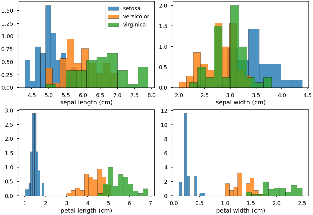
Generating histograms
In this example we make some histograms. This is intended for displaying distributions for raw data and possibly identifying “interesting” variables that might be able to distinguish between different classes of the data.
Assuming that the data is labelled into different classes,
this information can be passed to the histogram generating
method psynlig.histogram.histograms(). Specifically,
this is done by passing the labels for each data point (using
the parameter class_data) and a mapping from the labels
to something more human-readable (using the parameter class_names).
from matplotlib import pyplot as plt
import pandas as pd
from sklearn.datasets import load_iris
from psynlig import histograms
plt.style.use('seaborn-talk')


data_set = load_iris()
data = pd.DataFrame(data_set['data'], columns=data_set['feature_names'])

class_data = data_set['target']
class_names = dict(enumerate(data_set['target_names']))

variables = ['sepal length (cm)', 'sepal width (cm)',
             'petal length (cm)', 'petal width (cm)']


kwargs = {
    'histogram1d': {
        'alpha': 0.8,
        'edgecolor': 'black',
        'bins': 10,
        'density': True
    },
}


histograms(
    data,
    variables,
    class_names=class_names,
    class_data=class_data,
    **kwargs,
)

plt.show()
Total running time of the script: ( 0 minutes 0.692 seconds)