Note
Go to the end to download the full example code
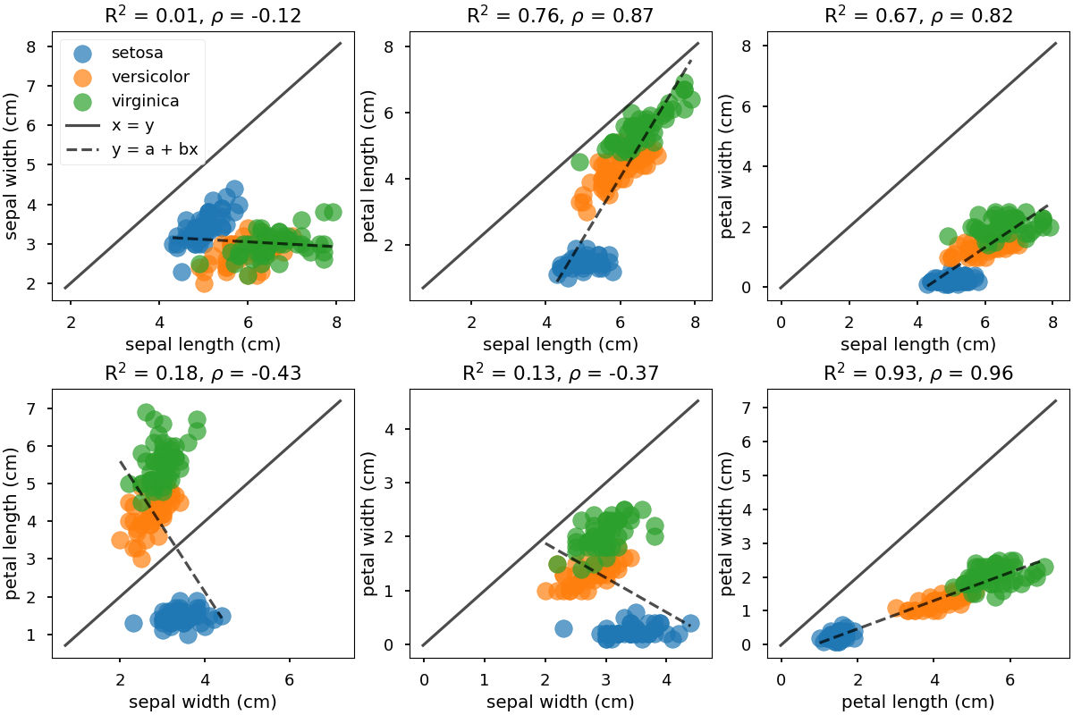
Generating 2D scatter plots
This example uses the method
psynlig.scatter.generate_2d_scatter()
for generating a set of 2D scatter plots of combinations of variables.
This is intended for investigating possible correlations visually
between pairs of variables.
The data points can be colored
according to class labels if this is available.
This is done by passing the labels for each data point (using
the parameter class_data) and a mapping from the labels
to something more human-readable (using the parameter class_names).
A trend line is added to the plot and the calculated coefficient of determination is shown in the plot (as \(R^2\)). In addition, the calculated Pearson correlation coefficient is also shown (\(\rho\)).
from matplotlib import pyplot as plt
import pandas as pd
from sklearn.datasets import load_iris
from psynlig import generate_2d_scatter
plt.style.use('seaborn-talk')


data_set = load_iris()
data = pd.DataFrame(data_set['data'], columns=data_set['feature_names'])
class_data = data_set['target']
class_names = dict(enumerate(data_set['target_names']))

variables = ['sepal length (cm)', 'sepal width (cm)',
             'petal length (cm)', 'petal width (cm)']


kwargs = {
    'scatter': {
        'marker': 'o',
        's': 200,
        'alpha': 0.7
    },
    'figure': {'figsize': (12, 8)},
}

generate_2d_scatter(
    data,
    variables,
    class_names=class_names,
    class_data=class_data,
    ncols=3,
    nrows=2,
    show_legend=True,
    xy_line=True,
    trendline=True,
    **kwargs,
)

plt.show()
Total running time of the script: ( 0 minutes 1.370 seconds)