psynlig.heatmap
The psynlig.heatmap module defines methods for generaing a heat map to show Pearson correlation coefficients for pairs of variables.
Example usage
To generate the following heat map:
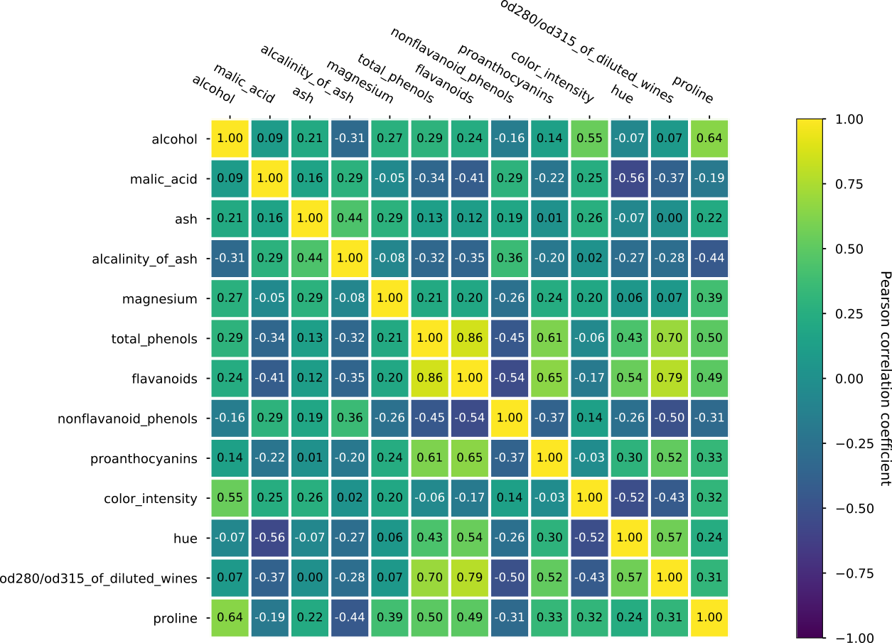
the method psynlig.heatmap.plot_heatmap() is used:
# Copyright (c) 2020, Anders Lervik.
# Distributed under the MIT License. See LICENSE for more info.
"""An example of generating a heat map of correlations."""
from matplotlib import pyplot as plt
import pandas as pd
from sklearn.datasets import load_wine as load_data
from psynlig import plot_correlation_heatmap
plt.style.use('seaborn-talk')


data_set = load_data()
data = pd.DataFrame(data_set['data'], columns=data_set['feature_names'])
kwargs = {
    'heatmap': {
        'vmin': -1,
        'vmax': 1,
        'cmap': 'viridis',
    }
}
plot_correlation_heatmap(data, textcolors=['white', 'black'], **kwargs)
plt.show()
psynlig.heatmap source code
A module defining helper methods for creating a heat map.
- psynlig.heatmap.annotate_heatmap(img, data=None, val_fmt='{x:.2f}', textcolors=None, **kwargs)[source]
Annotate a heatmap with values.
- Parameters
img (object like
matplotlib.image.AxesImage) – The heat map image to be labeled.data (object like
numpy.ndarray, optional) – Data used to annotate the heat map. If not given, the data in the heat map image (img) is used.val_fmt (string, optional) – The format of the annotations inside the heat map.
textcolors (list of strings, optional) – Colors used for the text. The number of colors provided defines a binning for the data values, and values are colored with the corresponding color. If no colors are provided, all are colored black.
**kwargs (dict, optional) – Extra arguments used for creating text labels.
- psynlig.heatmap.create_bubbles(data, img, axi)[source]
Create bubbles for a heat map.
- Parameters
data (object like
numpy.ndarray) – A 2D numpy array of shape (N, M).img (object like
matplotlib.image.AxesImage) – The heat map image we have generated.axi (object like
matplotlib.axes.Axes) – The axis to add the bubbles to.
- psynlig.heatmap.heatmap(data, row_labels, col_labels, axi=None, fig=None, cbar_kw=None, cbarlabel='', bubble=False, **kwargs)[source]
Create a heat map from a numpy array and two lists of labels.
- Parameters
data (object like
numpy.ndarray) – A 2D numpy array of shape (N, M).row_labels (list of strings) – A list or array of length N with the labels for the rows.
col_labels (list of strings) – A list or array of length M with the labels for the columns.
axi (object like
matplotlib.axes.Axes, optional) – An axis to plot the heat map. If not provided, a new axis will be created.fig (object like
matplotlib.figure.Figure, optional) – The figure where the axes resides in. If given, tight layout will be applied.cbar_kw (dict, optional) – A dictionary with arguments to the creation of the color bar.
cbarlabel (string, optional) – The label for the color bar.
bubble (boolean, optional) – If True, we will draw bubbles indicating the size of the given data points.
**kwargs (dict, optional) – Additional arguments for drawing the heat map.
- Returns
fig (object like
matplotlib.figure.Figure) – The figure in which the heatmap is plotted.axi (object like
matplotlib.axes.Axes) – The axis to which the heatmap is added.img (object like
matplotlib.image.AxesImage) – The generated heat map.cbar (object like
matplotlib.colorbar.Colorbar) – The color bar created for the heat map.
- psynlig.heatmap.plot_annotated_heatmap(data, row_labels, col_labels, cbarlabel='', val_fmt='{x:.2f}', textcolors=None, bubble=False, annotate=True, **kwargs)[source]
Plot a heat map to investigate correlations.
- Parameters
data (object like
numpy.ndarray) – A 2D numpy array of shape (N, M).row_labels (list of strings) – A list or array of length N with the labels for the rows.
col_labels (list of strings) – A list or array of length M with the labels for the columns.
cbarlabel (string, optional) – The label for the color bar.
val_fmt (string, optional) – The format of the annotations inside the heat map.
textcolors (list of strings, optional) – Colors used for the text. The number of colors provided defines a binning for the data values, and values are colored with the corresponding color. If no colors are provided, all are colored black.
bubble (boolean, optional) – If True, we will draw bubbles to indicate the size of the given data points.
annotate (boolean, optional) – If True, we will annotate the plot with values.
**kwargs (dict, optional) – Arguments used for drawing the heat map.
- Returns
fig (object like
matplotlib.figure.Figure) – The figure in which the heatmap is plotted.ax1 (object like
matplotlib.axes.Axes) – The axis to which the heat map is added.
- psynlig.heatmap.plot_correlation_heatmap(data, val_fmt='{x:.2f}', bubble=False, annotate=True, textcolors=None, **kwargs)[source]
Plot a heat map to investigate correlations.
- Parameters
data (object like
pandas.DataFrame) – The data we will generate a heat correlation map from.val_fmt (string, optional) – The format of the annotations inside the heat map.
bubble (optional, boolean) – If True, we will draw bubbles to indicate the size of the given data points.
annotate (boolean, optional) – If True, we will annotate the plot with values.
textcolors (list of strings, optional) – Colors used for the text. The number of colors provided defines a binning for the data values, and values are colored with the corresponding color. If no colors are provided, all are colored black.
**kwargs (dict, optional) – Arguments used for drawing the heat map.
- Returns
fig (object like
matplotlib.figure.Figure) – The figure in which the heatmap is plotted.ax1 (object like
matplotlib.axes.Axes) – The axis to which the heat map is added.