Note
Go to the end to download the full example code
Using custom color maps
This example will show how custom color maps can be used for generating colors.
from matplotlib import pyplot as plt
from matplotlib.colors import ListedColormap
import pandas as pd
from sklearn.datasets import load_wine
from sklearn.preprocessing import scale
from sklearn.decomposition import PCA
from psynlig import (
pca_explained_variance_pie,
pca_1d_loadings,
pca_2d_scores,
)
plt.style.use('seaborn-talk')
data_set = load_wine()
data = pd.DataFrame(data_set['data'], columns=data_set['feature_names'])
data = scale(data)
class_data = data_set['target']
class_names = dict(enumerate(data_set['target_names']))
pca = PCA(n_components=5)
scores = pca.fit_transform(data)
# Create some color maps:
colorbrewer = ListedColormap(
[
'#762a83',
'#af8dc3',
'#e7d4e8',
'#d9f0d3',
'#7fbf7b',
'#1b7837',
],
name='Colorbrewer'
)
bold = ListedColormap(
[
'#7F3C8D',
'#11A579',
'#3969AC',
'#F2B701',
'#E73F74',
'#80BA5A',
'#E68310',
'#008695',
'#CF1C90',
'#f97b72',
'#4b4b8f',
'#A5AA99'
],
name='bold',
)
dompap = ListedColormap(
[
'#BB4E37',
'#7791BB',
'#7C635B',
],
name='dompap',
)
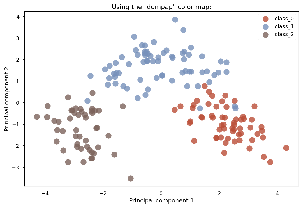
figures, axes = pca_2d_scores(
pca,
scores,
class_data=class_data,
class_names=class_names,
select_components={(1, 2)},
s=200,
alpha=.8,
cmap_class=dompap,
)
axes[0].set_title('Using the "dompap" color map:')
figures[0].tight_layout()
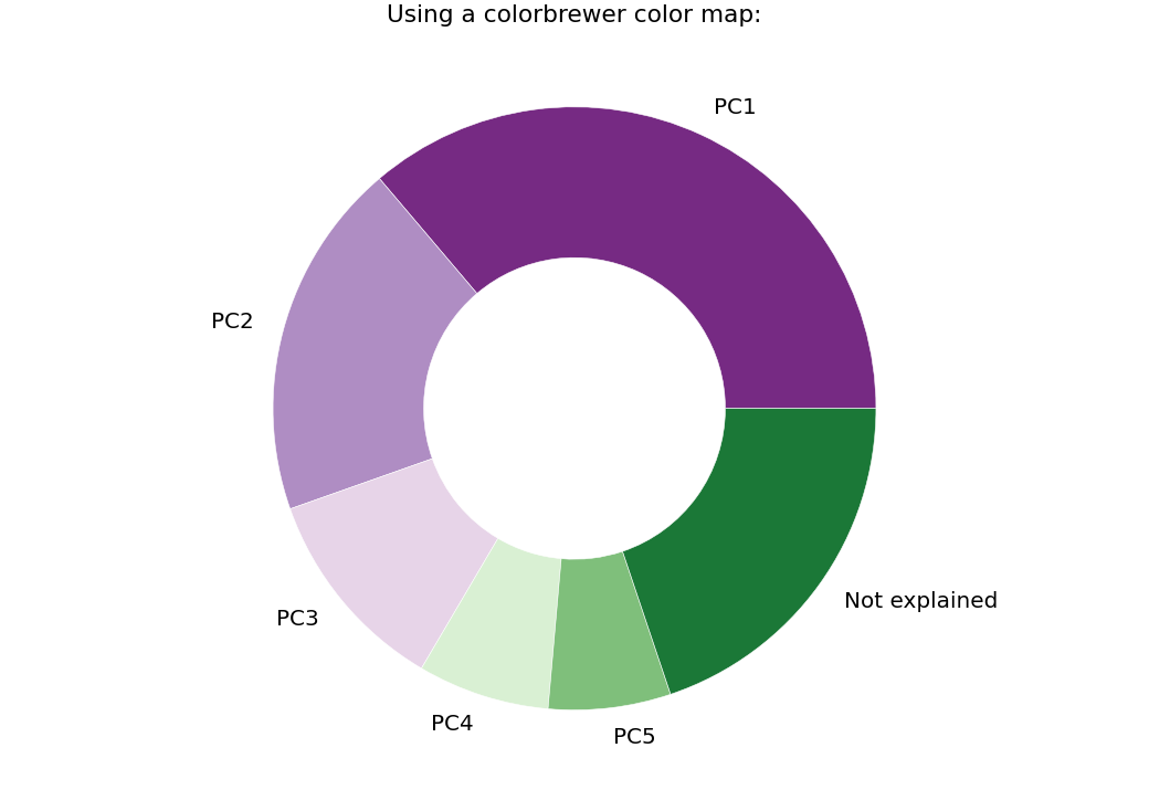
_, axi = pca_explained_variance_pie(pca, cmap=colorbrewer)
axi.set_title('Using a colorbrewer color map:')
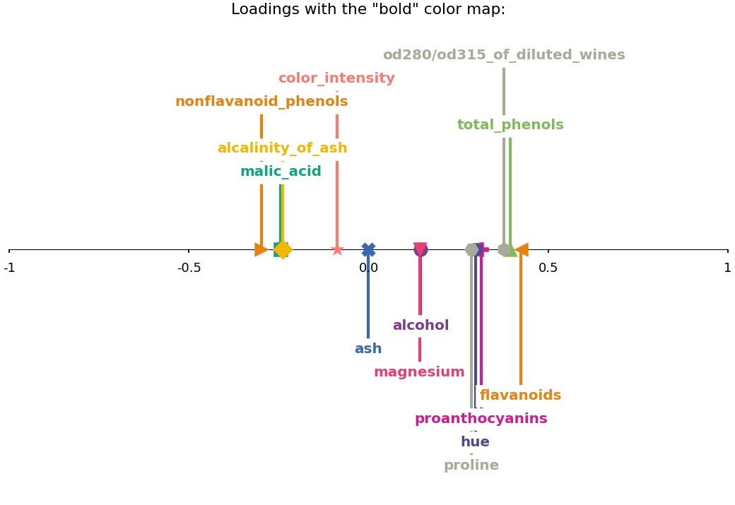
_, axes = pca_1d_loadings(
pca,
data_set['feature_names'],
select_components={1},
cmap=bold,
text_settings={'weight': 'bold', 'fontsize': 'x-large'}
)
axes[0].set_title('Loadings with the "bold" color map:')
plt.show()
Total running time of the script: ( 0 minutes 0.670 seconds)