Note
Go to the end to download the full example code
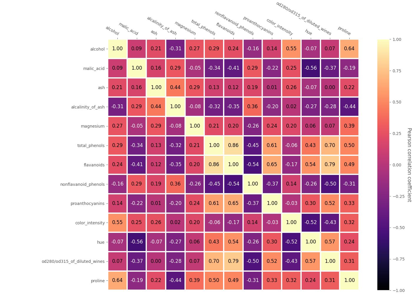
Styling a heat map of correlations
This is an example of styling a heat map for showing correlations between variables. The correlation between variables is obtained as the Pearson correlation coefficient.
from matplotlib import pyplot as plt
import pandas as pd
from sklearn.datasets import load_wine as load_data
from psynlig import plot_correlation_heatmap
plt.style.use('ggplot')


data_set = load_data()
data = pd.DataFrame(data_set['data'], columns=data_set['feature_names'])

kwargs = {
    'text': {
        'fontsize': 'large',
    },
    'heatmap': {
        'vmin': -1,
        'vmax': 1,
        'cmap': 'magma',
    },
    'figure': {'figsize': (14, 10)},
}

plot_correlation_heatmap(data, textcolors=['white', 'black'], **kwargs)
plt.show()
Total running time of the script: ( 0 minutes 1.239 seconds)